New energy saving advice pages launched
If you have opened Energy Sparks this morning and found things look a little different, that’s because we have launched our exciting new advice pages.
Over the last few months, our developers have been working hard to improve our detailed analysis pages designed primarily for our older student and adult users. We’ve taken onboard feedback from users and have tried to achieve the following:
- Make the content more accessible to non-specialists
- Present clear calls to action and recommendations to address the energy management issues identified for your school
- Use visual comparisons for benchmarking
- Separate background information from school specific analysis
- Improve the navigation on Energy Sparks so you can more easily find the information you need
- Link the dashboard and email alerts directly to the new analysis pages.
Here are a few things to look out for that have changed:
We have introduced “breadcrumbs” at the top of the page to help schools find their way around the site (and back again). There is also a new side navigation bar which again, should make getting around a little easier. We also have some tabs at the top of each advice page which show various different levels of detail.

We have replaced the “star page” with a new energy advice landing page. The overview tab now shows a red/ amber/ green rating which is linked to the school benchmarks, showing how your school matches up against schools of a similar type and size.

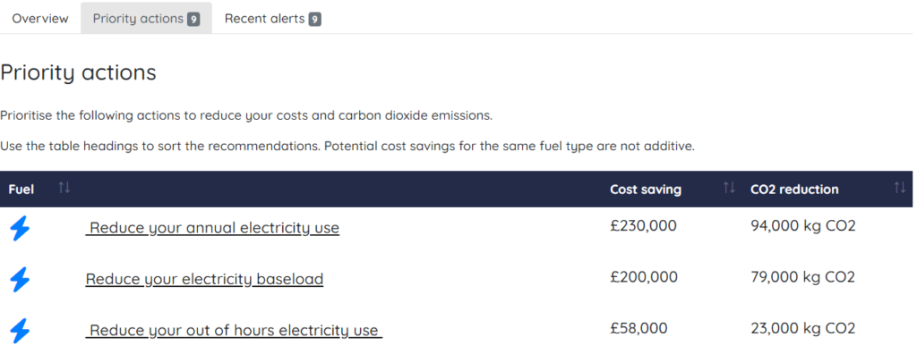
The priority actions tab is very similar to the Energy saving opportunities on the adult dashboard, but can be sorted so that schools can quickly identify the actions which will make the biggest savings in cost or carbon. These are all directly linked to the relevant advice page. The recent alerts tab shows all the alerts which will have been in your most recent alert emails and these are also linked to the page which can give you more information.
Each of the advice pages (which can be found on the navigation bar on the left) now have three tabs. The insights tab will give you instant information – what does this page do, how is my school doing, what should I do about it? It has a useful visual comparison for benchmarking your school against others and at the bottom of the page there are suggestions of relevant activities to help you make improvements.

The analysis page gives more detailed analysis for that measure, with the same charts you will be used to seeing in the previous pages. Analysis and explanations have been updated to make it clearer to non-specialists what to look for. We also have some new tables giving annual average baseload data and energy consumption for each holiday. Some of our benchmarks have also been updated now that we have a much larger database of schools to compare. See our blog post here.
The Learn more tab separates out some of the background information and general advice from the specific analysis. In here you will get a bit more information about what an advice page is doing, and what sort of things to look out for on the page and around your school.
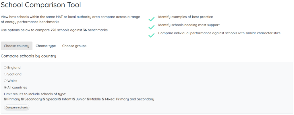
And finally our school comparison tool has been updated to make it much easier to use. If you are logged in, it will automatically select schools in your group, but you can choose to expand that to additional groups, school types or even all schools in England Scotland or Wales. If you have a number of favourite comparisons that you tend to use on a regular basis, you can also bookmark them in your browser to make it quicker next time you need to do it.