How to spot problems now your heating is on

So your heating is on and you think it’s set up correctly. But how can you be sure that everything is working as expected? Find out how Energy Sparks tools can help you stay on track to save energy this winter.
One of the most important things to do when using your Energy Sparks account is to ensure that what your data is showing makes sense to you. And if it doesn’t, ask yourself why.
There’s a peak here, do I know what caused that?
Gas was high during that weekend, do I know why?
Am I using more gas this week because it’s colder, or because something has changed in my school?
Do I think my data looks completely wrong?*
This blog post will take you through how to use your Energy Sparks charts and analysis to check that your heating is doing what it is meant to be doing, and how to translate what you learn into energy savings.
Some of our analysis requires a year of data, or at least a whole heating season, which means some of the more detailed analysis described here might not appear on your dashboard yet. So let’s start with the simplest format we present data in – as long as you have gas heating and gas data on Energy Sparks, you can use this bit!
Energy Sparks overview charts

These charts are very simple and should be straightforward for staff and pupils to use. The chart above is the gas overview chart, which you can find by clicking on Explore energy data on a school’s adult dashboard, then on the Gas overview tab above the chart.
Every bar shows how much gas has been used each week over the last 12 months (or for all the full weeks for which we have gas data available, if less than a year).
The colour coding shows how much gas was used when the school was open or closed.
There is a degree days line that shows how cold it has been outside during that period. The higher the degree days line, the colder it is outside, and the more energy is needed to heat a building. Therefore, the amount of gas used (the bars) should follow the degree days line quite closely (except during holidays when the heating should be off).
What to look for in the overview charts:
- Check that the amount of gas used each week follows the degree days line. Your gas use should not be high when degree days are low.
- Make sure that the red holiday bars are lower than the term time bars. If your holiday bars are following the degree days line, this suggests that the heating has been left on term-time settings.
TIP: Ideally, gas use should be close to zero during holidays, with a small amount required
for hot water and some needed for frost protection when it’s very cold.
- Check that the amount of gas used at weekends is less than weekdays. Click on a bar to zoom into that week and see gas used on each day.
Our overview charts are interactive. This means that units can be changed between kWh, £ and kg CO2; parts of the legend can also be switched off and on (which is particularly useful with our meter charts for schools with multiple meters).
You can also move backward and forward in time as well as zoom in by clicking on the bars of the chart to see how energy use is spread across a week or throughout a day.
10-MINUTE TASK: Click on a few different weeks in your chart to get a sense of how your gas use is spread across the days. If your gas use is as high at the weekend as it is during the week, you need to look again at your boiler settings. We recommend you pick some colder and some warmer weeks within a heating season to see if there is any difference.
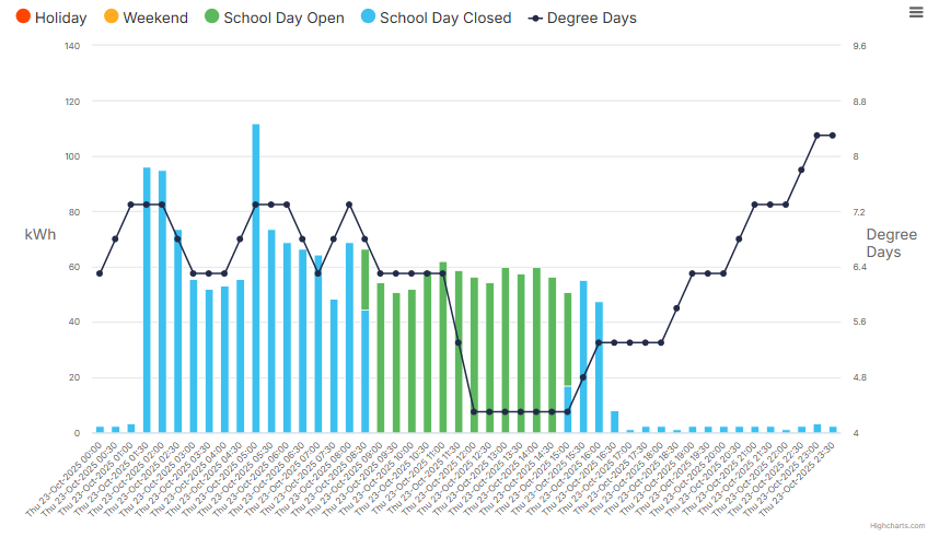
- Check your heating timing by looking at your daily view
By clicking on any day of a week, users can zoom in to see consumption for each half hour period of that day.
The chart below shows a school with its heating coming on at 1:30am and going off at around 4:30pm.
It’s very common that heating comes on earlier than required in schools, and often people working in schools aren’t aware of this until they see it in their charts. We have another blog post that explains some of the common causes.
Again, click on a few days to see what is normal for your school.
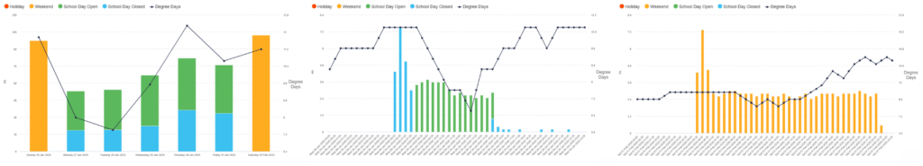
Case study: St Nicholas Priory School
Last year, St Nicholas Priory School noticed that their gas use was high at weekends. The charts below show a single week, where gas use was higher on weekend days than during weekdays. They investigated and found that their weekend settings weren’t doing what they thought they were.
In 12 months, the school saved £9,800 and 30 tonnes CO2 by making some simple changes to their heating settings.
Heating control advice page
Energy Sparks presents analysis to help you improve heating control at your school.
This can be found by clicking on Explore energy data on a school’s adult dashboard, then on Heating control under Gas on the left hand side of the screen. Schools need a full winter heating season’s worth of data available on Energy Sparks for some of the analysis on this page.
What to look for in the heating control page
The Insights tab gives you a top line summary of where you can make savings, including how much gas is being used to heat the school on warmer days when the heating isn’t needed, and how much you could save by reducing the set temperature by 1oC. You will also find suggested activities if this is an area you want to work on.
You can then click through to the Analysis tab for more detail.
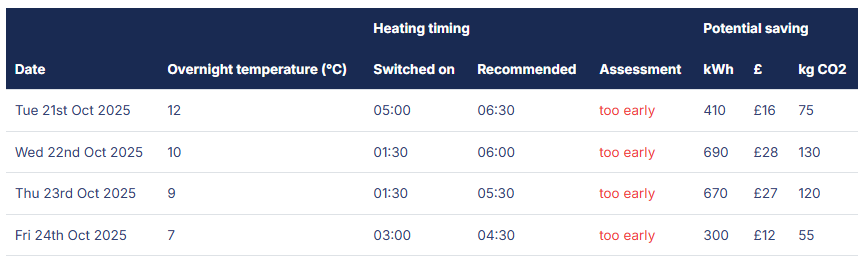
Energy Sparks runs some analysis to work out what time your school’s heating is switching on each day. When your heating is on, this page will present a table showing data for the last seven days:
- when the heating came on in the morning;
- what the overnight temperature was;
- what time Energy Sparks calculates that your heating should have come on; and, therefore,
- the savings you might have made if the heating came on at the recommended time.
The analysis also estimates total savings over a whole year if this advice were followed.
Gas usage for heating during the day
The following chart appears in both the Heating control page and the Out of school hours gas page. It shows the total amount of gas used on school days when heating is on in the winter over the last 12 months. This consumption is broken down into half hour periods through the day. So, for example, the bar for 10am shows all the gas used between 10am and 10:30am for every school day when the heating was on over the last 12 months.
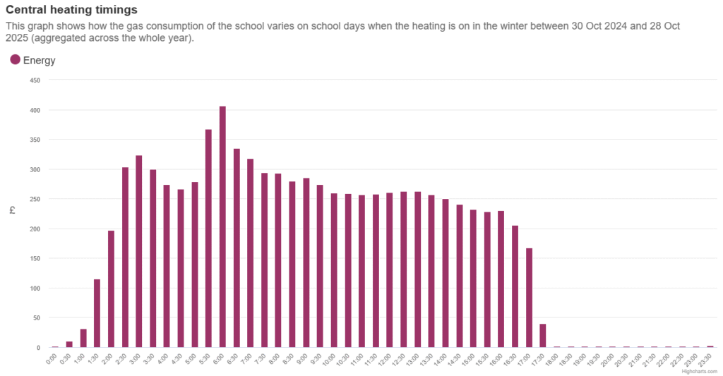
TIP: Use the interactive features to switch to viewing data in £. Now we can see that this school is using around £250 for every half an hour of heating (over the whole year). So if the school put the heating on half an hour later every single day, the school would save £250 in a year. If we put the chart into kg CO2, it shows the equivalent potential saving of over around 1,200 kg CO2!
For most schools, heating doesn’t need to come on more than about an hour before school starts, and it can go off again about half an hour before the end of school.
But (in the above example) it’s a big jump to change heating start time from 1:30am to 8am, so it’s worth experimenting. Try putting the heating on an hour later, see how people react, monitor temperatures and then decide whether to try putting it on later.
Thank you for reading this far!
If you have read this far, thank you for your time. It’s a long post, but one that could potentially save your school a lot of money and carbon dioxide emissions.
Knowledge is power, so taking some time to review what your Energy Sparks dashboard is telling you could be incredibly valuable. Don’t forget, there are other analysis pages that could help you to save energy within your school. Why not join one of our training webinars, or view our video induction series.
And we are always here to help. Email support@energysparks.uk for any help needed with your account.
* Note that it’s extremely rare that we’re sent incorrect data from your energy companies, but if you think it’s happened we’d rather you let us know.